In addition to CpG sites, there are 4 sets of genomic regions to be covered in the analysis. The table below gives a summary of these annotations.
| tiling |
n.a. |
568648 |
| genes |
n.a. |
52647 |
| promoters |
n.a. |
56639 |
| cpgislands |
n.a. |
27257 |
Region length distributions
The plots below show region size distributions for the region types above.
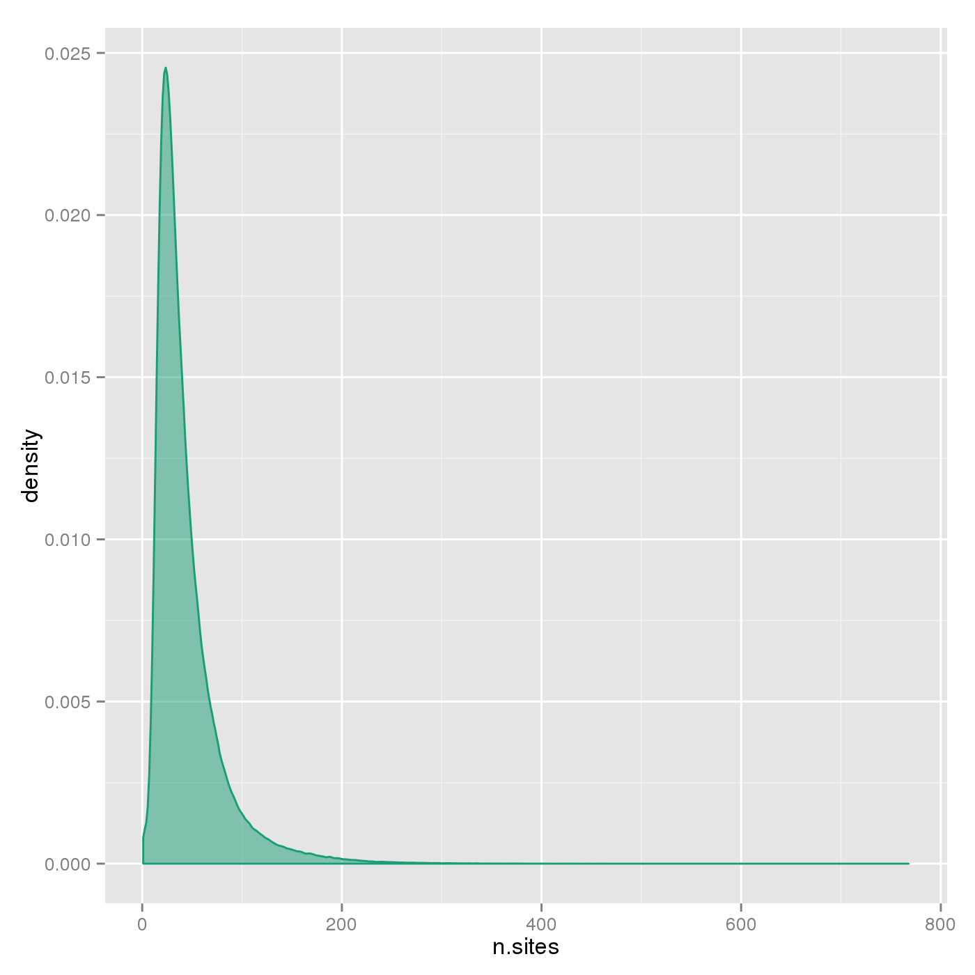
Number of sites per region
The plots below show the distributions of the number of sites per region type.
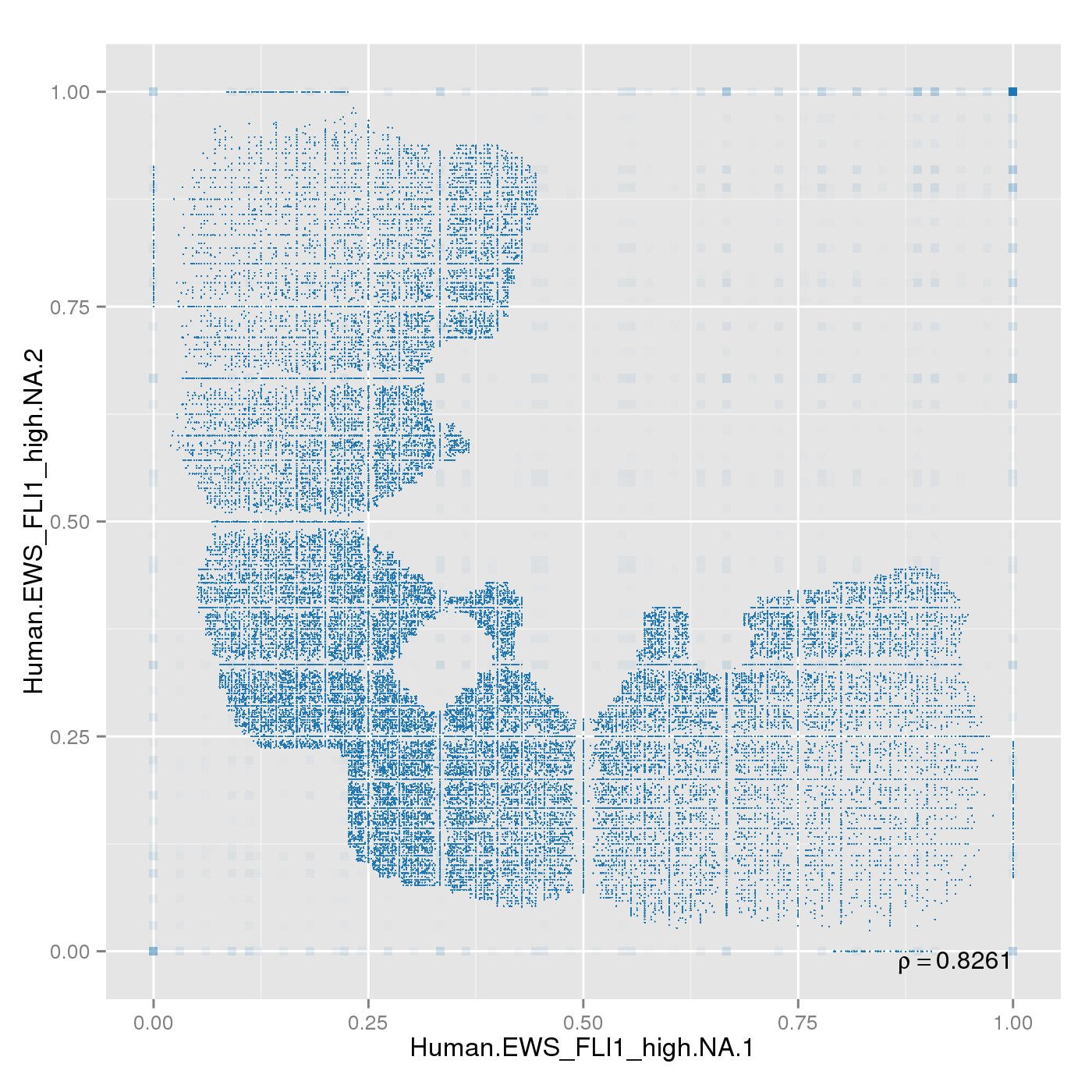
Sample replicates were compared. This section shows pairwise scatterplots for each sample replicate group on both site and region level.
The following table contains pearson correlation coefficients:
| 0.8261 |
0.8543 |
0.8925 |
0.9559 |
0.987 |
| 0.8074 |
0.8496 |
0.8854 |
0.9546 |
0.9857 |
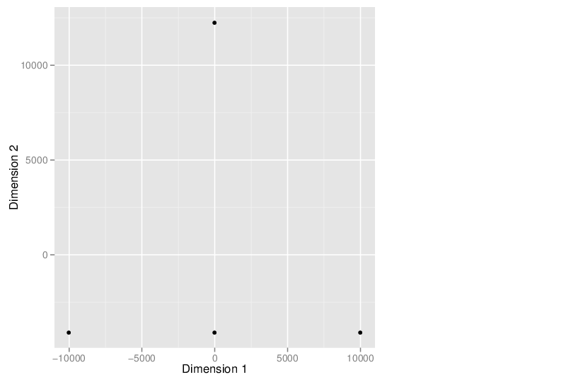
Dimension reduction is used to visually inspect the dataset for a strong signal in the methylation values that is related to samples' clinical or batch processing annotation. RnBeads implements two methods for dimension reduction - principal component analysis (PCA) and multidimensional scaling (MDS).
The analyses in the following sections are based on selected sites and/or regions with highest variability in methylation across all samples. The following table shows the maximum dimensionality and the selected dimensions in each setting (column names Dimensions and Selected, respectively). The column Missing lists the number of dimensions ignored due to missing values. In the case of MDS, dimensions are ignored only if they contain missing values for all samples. In contrast, sites or regions with missing values in any sample are ignored prior to PCA.
| sites |
MDS |
24962867 |
0 |
20000 |
NA |
| sites |
PCA |
24962867 |
11236574 |
20000 |
4.2 |
| tiling |
MDS |
568648 |
0 |
20000 |
NA |
| tiling |
PCA |
568648 |
3350 |
20000 |
45.9 |
| genes |
MDS |
52647 |
0 |
20000 |
NA |
| genes |
PCA |
52647 |
3329 |
20000 |
97.9 |
| promoters |
MDS |
56639 |
0 |
20000 |
NA |
| promoters |
PCA |
56639 |
975 |
20000 |
94.0 |
| cpgislands |
MDS |
27257 |
0 |
20000 |
NA |
| cpgislands |
PCA |
27257 |
486 |
20000 |
99.4 |
Multidimensional Scaling
The scatter plot below visualizes the samples transformed into a two-dimensional space using MDS.
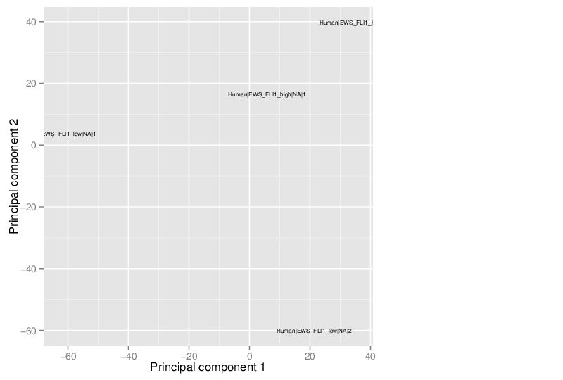
Principal Component Analysis
Similarly, the figure below shows the values of selected principal components in a scatter plot.
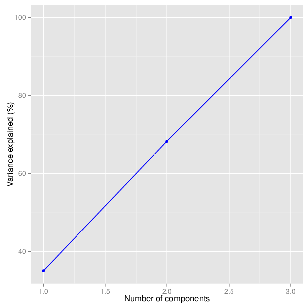
The figure below shows the cumulative distribution functions of variance explained by the principal components.
The table below gives for each location type a number of principal components that explain at least 95 percent of the total variance. The full tables of variances explained by all components are available in comma-separated values files accompanying this report.
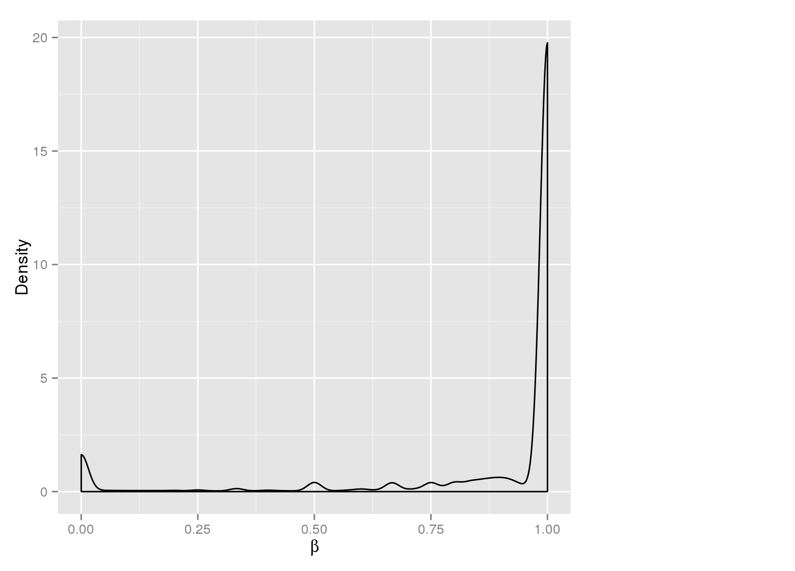
Methylation value distributions were assessed based on selected sample groups. This was done on site and region levels. This section contains the generated density plots.
Methylation Value Densities of Sample Groups
The plots below compare the distributions of methylation values in different sample groups, as defined by the traits listed above.
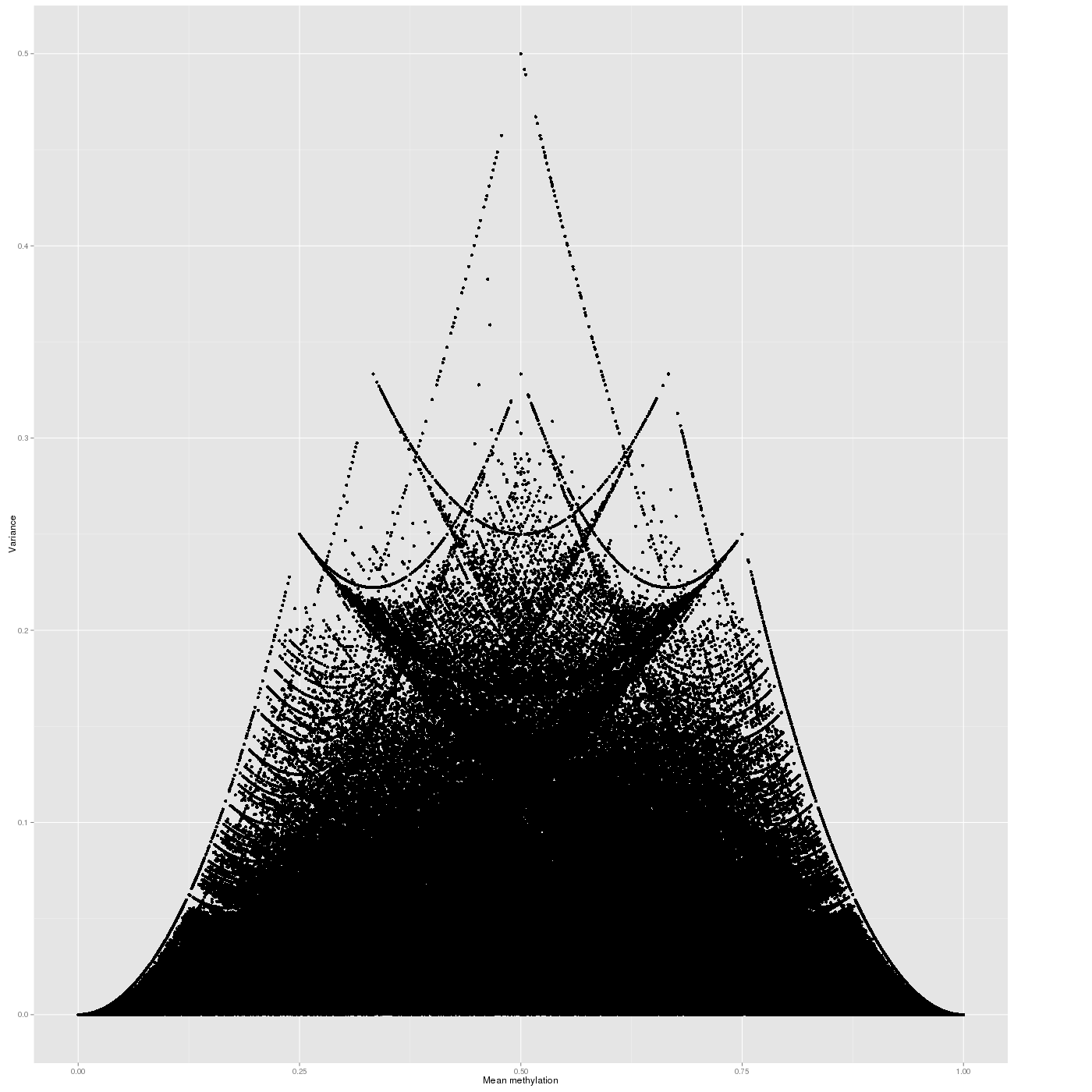
Inter-sample Variability
The variability of the methylation values is measured in two aspects: (1) intra-sample variance, that is, differences of methylation between genomic locations/regions within the same sample, and (2) inter-sample variance, i.e. variability in the methylation degree at a specific locus/region across a group of samples.
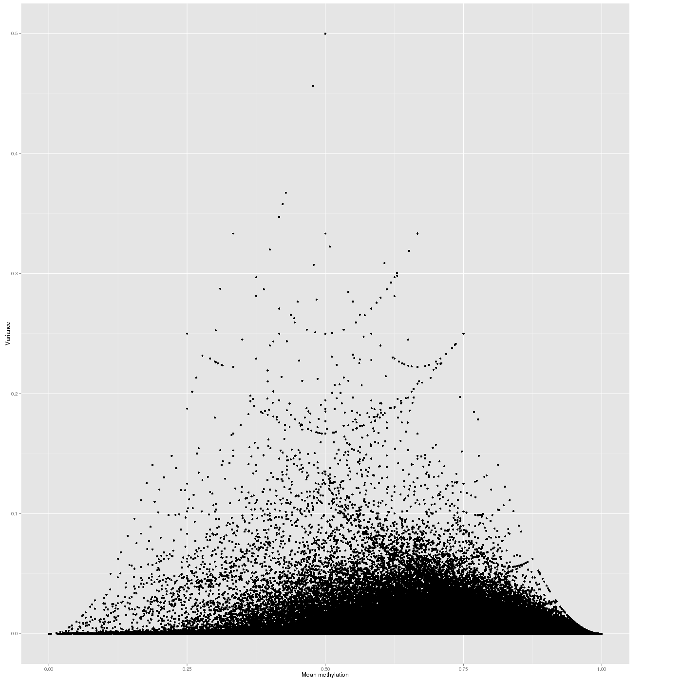
The following figure shows the relationship between average methylation and methylation variability of a site.
In a complete analogy to the plots above, the figure below shows the relationship between average methylation and methylation variability of a genomic region.
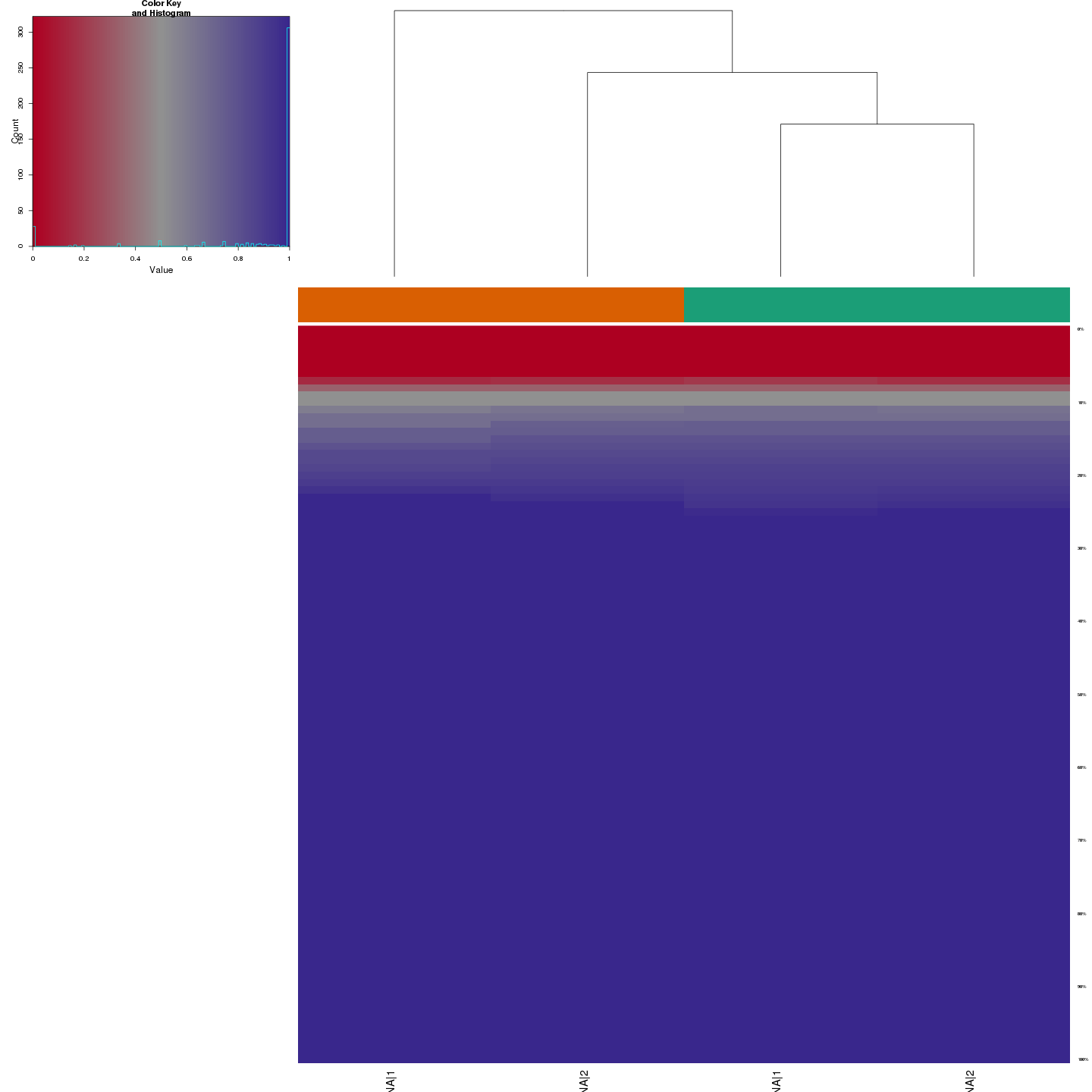
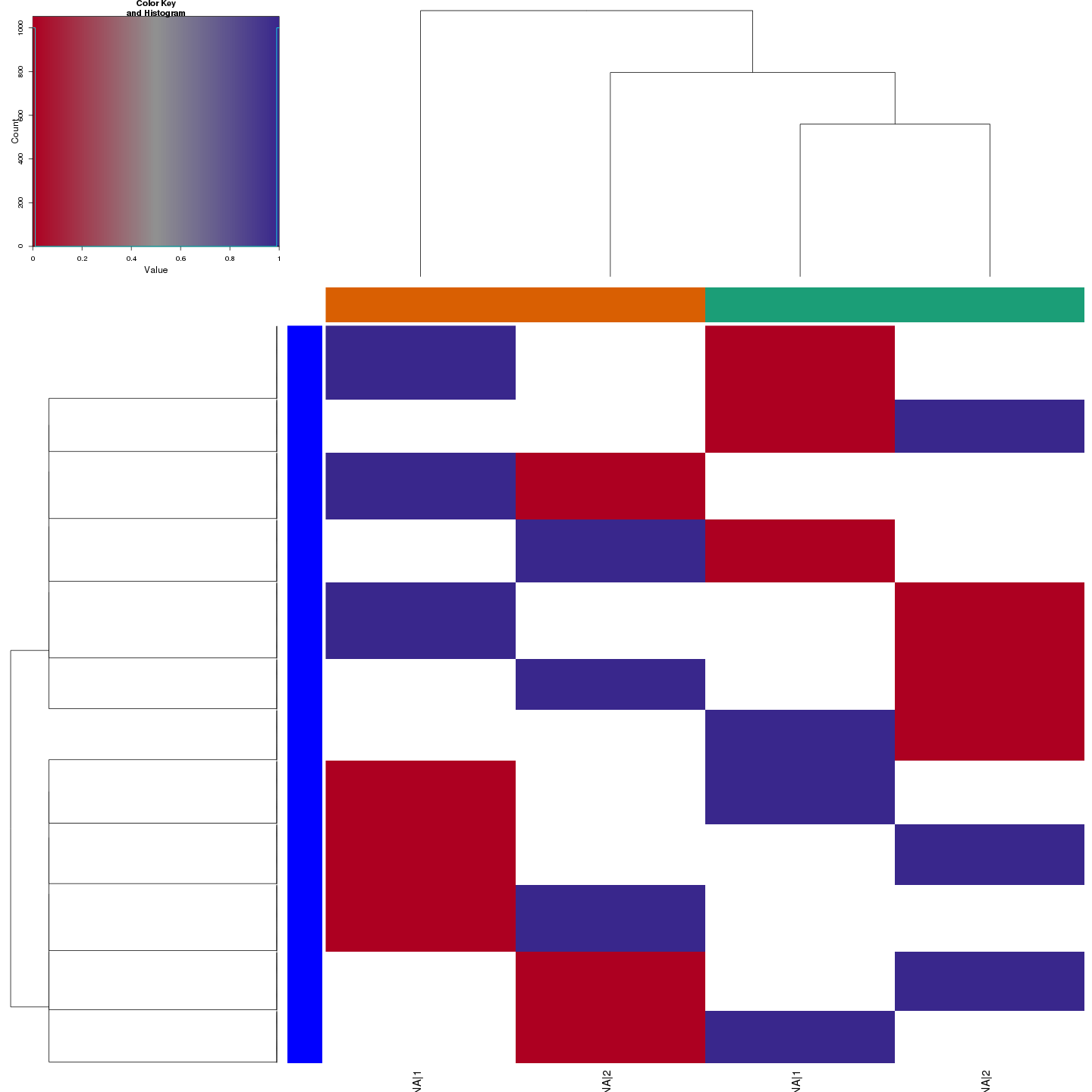
The figure below shows clustering of samples using several algorithms and distance metrics.
Identified Clusters
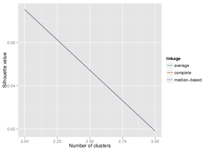
Using the average silhouette value as a measure of cluster assignment [1], it is possible to infer the number of clusters produced by each of the studied methods. The figure below shows the corresponding mean silhouette value for every observed separation into clusters.
The table below summarizes the number of clusters identified by the algorithms.
Clusters and Traits
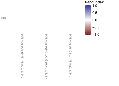
The figure below shows associations between clusterings and the examined traits. Associations are quantified using the adjusted Rand index [2]. Rand indices near 1 indicate high agreement while values close to -1 indicate seperation. The full table of all computed indices is stored in the following comma separated files:
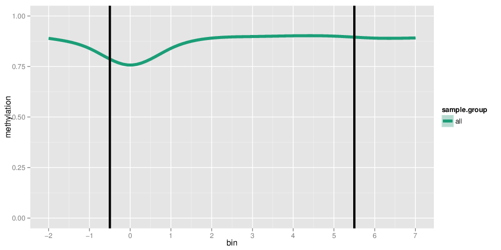
Methylation profiles were computed for the specified region types. Composite plots are shown.
Each individual region was subdivided into bins of equal sizes according to the following table:
#bins denotes the number of bins a region has been divided into. #extension bins indicates the number of bins that have been prepended and appended to a region